
12. Measuring Behavior
Note
This chapter authored Todd M. Gureckis and is released under the license for the book. David Heeger made several contributions by allowing sourcing some material from his lecture notes posted here.
from IPython.core.display import HTML, Markdown, display

import numpy.random as npr
import numpy as np
import pandas as pd
import seaborn as sns
from cycler import cycler
import matplotlib.pyplot as plt
import scipy.stats as stats
import statsmodels.formula.api as smf
from celluloid import Camera
import ipywidgets as widgets
from matplotlib.patches import Polygon
from matplotlib.gridspec import GridSpec
from myst_nb import glue # for the Jupyter book chapter
The last few chapters have provided a review and update to your understanding of statistical analysis. However, lets not lose sight of what we are analyzing and why. In cognitive science, the goal is to understand the way the mind works. However, we can only do this typically by observing the behavior of a person. The goal of experimental approaches to behavior is to record how people behave in different circumstances and to infer from that aspect of how their mind must be functioning.
In this chapter we are just going to step through some of the different measurements of behavior commonly used in research into human cognition and perception. Our goal in this review is to make sure everyone is aware of these different measures, what they are good for, discuss some of the technical issues with the measure, and some of the issues in analysis and interpretation of these measures. Generally when doing research projects researchers spend a lot of time discussing with their students and colleagues the best behavioral measures to use for the task at hand and so creatively using these measures is an important part of the scientific process. The list we consider here is not comprehensive but gives a general overview of many of the most common measurement approaches.
We are going to begin with a range of options that are super interesting but someone more exotic and advanced, before turning to the analysis of the two mainstays of cognition and perception research: response accuracy and reaction time. For these two we will develop a bit of theory about the proper ways to analyze these types of measures and several of the issues that come up.
12.1. Self-report and introspection
Perhaps the most obvious approach to studying internal cognitive and perceptual processes is just to ask people questions. Think of the classic Rorchact test which simply shows a subject an unfamiliar shape or picture and ask “what does this remind you of?”
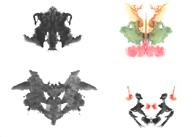
Fig. 12.1 Examples of the original Rorschach inkblot stimuli.
In cognition or perception, our questions might be more targeted toward what is known as introspection about how a particular judgment, inference, or reason was made. For example, if you see someone buy something in the store, you might ask “Why did you buy that item?” and “What can you tell me about the steps you took mentally when making that decision?” To this a person might answer “Well, I always attend to price and quality when making supermarket purchases and so I weighted them carefully and decided that this particular product best met my needs.”
Introspection is a super valuable tool for guiding intuitions about cognitive research. Despite this you might be surprised by how little of the published research in cognition and perception relies on introspection. Why is introspection cast aside in the science of the mind.
There’s probably several answers to this but at least one is that introspective data is often “unstructured” in that there isn’t a simple number or quantity assigned to the verbal introspective report. This makes quantitative analysis more tricky. There are ways around this, for example there are many tools for natural language processing develop in machine learning/artifical intelligence that might be able to automatically extract information from unstructured text (e.g., you could write a program to check if a particular word was mentioned in a text string or to count the frequencies of different words). However, it is more complex and there are many different approaches you could take leading to a phenomena known as the “garden of forking paths” where there are many different ways you could analyze you data and there are unknown consequences to all the choices.
A second issue is more interesting and even tells us something important about psychology – introspective reports are often unreliable and evidently invalid. What do I mean by this? Well if you ask someone how they solved the problem they might not really have a good idea. However since you asked them they have to come up with some answer and so they tell you some story about how they made the decision that sounds like they are a nice reasonable person. However, this might not be really how they made the decision and the person might actually have no real access to this question.
12.1.1. Introspective blindness
Two interesting examples are taken from a review article about introspection by Nisbett and Wilson [Nisbett and Wilson, 1977]. In one experiment [M.D. and Nisbett, 1970], subjects with insomina were asked what time they go to bed and what time they fell asleep on two consequentive nights. In one condition (Arousal) people were given a placebo pill and told to take it 15 minutes before going to bed for the next two nights. They were told the pill would increase heart rate, body heat, breathing, etc… (things associated with insomnia). In another condition (Relaxation) subjects were told the pills would calm them down in all the opposite ways (lower hear rate, etc…). Subjects in the arousal condition fell asleep more quickly compared to the previous nights because they attributed the problems sleeping to the pill. In constract, subjects in the relaxation condition took longer to get to sleep. This was actually the hypothesis of the study (however counter-intuitive you find attributional effects like this). However, more interested in that in an interview after the experiment concluded their data was described to them and the experimenter asked why they went to bed earlier or later. Arousal subjects reported all kinds of explanations like being more relaxed because they were past a deadline, or were not longer fighting with a partner, etc… Subjects generally denied that the pills had any effect on their sleep nor did they agree they had even thought about them. Even after being told about the hypothesis of the study subjects in these types of experiments deny that it influenced them in this way even if they sometimes agree that other people might be influenced this way.
The bigger point of course is that their behavior was obviously manipulated by the experiment they were in, the experiment was explained to them, including the hypothesis and they still believed some other cause explained why they went to bed1.
12.1.2. Introspective blindness and problem solving
A related example related to problem solving is that Maier (1931)[Maier, 1931] did a problem solving task where subjects were asked to connect to strings hanging parallel from the ceiling. They were provided in the room with a series of objects such as poles, ringstatnds, clamps, pliers, and extension cords. The trick was the the strings were far enough a part that you can’t grab them both at the same time with your hands. People did come up with solutions (like making an extension cord) but were asked “ok do it a different way” until eventually many became stumped. Then the experimenter were random around the room and just kind of push one of the stings a little bit so it started swinging like a pendulum. Then, very quick, the subject would tie a weight to one of the strings and make it a real pendulum and solve the task. When quizzed how they did this subjects would say things like “It just dawned on me” or “I just realized the cord would swing faster if I fastened a weight to it.” When a lot of follow up about 1/3 of subjects eventually admitted the experimenters “hint” might have helped them.
12.1.3. Should you use it?
So does this mean you should never use introspection in your research? I don’t think that is really a good idea and there are many examples where introspective descriptions can be really important and valuable data. However, it is useful to know that you can’t always trust it to a perfect read out of a persons actual behavior.
12.2. Ratings
As we move away from self-report and introspective reports, we start looking at things we can quantify more easily. One example is questionaire type studies because they move from unstructured data of self-report to a more structured format with multiple questions probing particular question with, often, structured response options. For this I am including things like true/false questions, multiple choice questions, pick the best from an set questions, etc…
For most of these types of data this is pretty obvious. They are also a pretty appealing type of study to run because there are so many tools that make it easy to administer questionaires.
There’s not a ton to say about this really except to maybe dive into one particular type of response format in a questionaire known as the rating scale because there actually is a bit of intellectual structure built up around the ways to construct and measure someone’s response on a rating scale.
Since their introduction by Thurstone (1929) and Likert (1932) in the early days of social science research in the late 1920s and early 1930s, rating scales have been among the most important and most frequently used instruments in social science data collection. A rating scale is a continuum (e.g., agreement, intensity, frequency, satisfaction) with the help of which different characteristics and phenomena can be measured in questionnaires. Respondents evaluate the content of questions and items by marking the appropriate category of the rating scale. For example, the European Social Survey (ESS) question “All things considered, how satisfied are you with your life as a whole nowadays?” has an 11-point rating scale ranging from 0 (extremely dissatisfied) to 10 (extremely satisfied).
As one context of question response, rating scales can lead to both desirable effects, such as enhancing the intended understanding of the range and frequency, and undesirable effects, such as acquiescence (i.e., the tendency to agree with items regardless of their content). These undesirable effects can be reduced by designing rating scales in a certain way. Not only the number and labelling of response categories but also graphical features of rating scales, such as scale orientation or the use of colours, type fonts, and shading, can influence the way in which rating scales are understood (visual design, e.g., Tourangeau, Couper & Conrad, 2004; 2007). The objective of rating scale design is to motivate respondents to answer the questions in a diligent way (so-called optimising; Krosnick & Alwin, 1987). Generally, the task of answering questions should not be too complex or difficult, nor should it unnecessarily tempt the respondents to reduce their cognitive burden (so-called satisficing; Krosnick & Alwin, 1987).
Menold & Bogner (2016) provide a comprehensive summary of the features of ratings scales that are important. I’ll refer you to that paper for the original research and instead just report a few tips on using rating scales in studies that you might find useful.
12.2.1. Number of response options
How many response options should a rating scale have? A traditional suggestion is to have 5 or 7 points on a scale (often you want an odd number so there is a expressable “middle point”). However, some studies have found that the reliability increases for a larger number of categories (e.g., 100 points on the scale). Generally though most poeple use the 5-7 rule.
12.2.2. Category labels
Should you scale include labels of particular values along the scale? There are at least two options. You can label things with number (e.g., 1-7) or words (e.g., “lowest”, “higest”). The latter type are called verbalized scales and are some studies that suggest these are better particular for people with low or moderate formal education.
12.2.3. Scale midpoint
Generally some scales naturally have a midpoint of neutral response. Generally this is preferred over forcing the subject to choose a slightly positive or negative response when they really don’t care.
12.2.4. Don’t know or no opinion options
Another option is to have an explicit “opt out” of the scale like a “N/A” or “Don’t know” option. This is good because data quality can be lowered when subjects are forced to answer questions they don’t really want to answer. However it can depend somewhat on the analysis approach you plan to take and the research question you have.
12.2.5. Likert scales
A Likert scale refers to a ratin scale in which the dimension is agreement – for example, agree/disagree or completely disagree/completely agree. They are often used to elicit opinions or subjective beliefs about a topic or question. In this case a statement might be offered and then people express a level of agreement. An alternative alters the words slighly to be item specific. So instead of repeatedly asking disagree/agree the wording for each item in multiple question survey is altered to match the content of the item.
12.2.6. Graphical representations
How do you represent a rating scale? Many survey building tools like Google Forms or Qualtrics provide certain interface elements (sometimes known as “widgets”) that help to make rating scales. There isn’t a lot of specific research on which are better. However, be advised that in online environments we have sometimes found that people who are right handed will have a slight bias in their use of “slider” type scales partly under the idea that they find it harder to move a scale all the way to the left given the computer mouse.
12.3. Mouse tracking
Fig. 12.2 Examples of a mouse tracking experiment.
Another behavioral measure of interest for online experiments is mouse tracking. This is done several ways but most often in the web browser you can track the x,y position of the computer mouse as it moves around a page. Advertisers even do this to gauge your interest in things. So for instances some websites monitor your mouse while you are shopping and if you hover over certain options it indicates possible interest in a purchase (it “caught your eye”) and so they will start targetting you with ads of that product.
Mouse tracking can be useful as a cheap way to monitor the attention of someone as they explore or gather information. Perhaps the most famous version of this is the Mouselab system by Martijn Willemsen and Eric Johnson which was used to study decision making. People in these types of experiments are asked to decide between several options (e.g., buying a product) and there are several attributes or features. These features are hidden initially unless the subject moves their mouse over the box to reveal what is underneath. By analyzing which features people select to “uncover” and the position of the mouse on the screen, one can get information about what attributes people consider when making decisions.
12.4. Eye movements
Related to mouse tracking, eye tracking is a technology that can measure the point of gaze or motion of the eye relative to the head. Eye trackers
12.5. Pupil dilation
Many eye tracking systems also measure pupil dilation of a subject. The pupil of the eye expands and contracts due to available light. However, if you hold the amount of light in a room constant there are several findings that suggest that pupil dilation can index cognitive processes. For example, early work showed that pupil dilation was changed when people were holding more items in working memory. In addition, pupil dilation has been linked in various ways to decision making processes. For example, a famous idea is that the neurotransmitter neuroepinephren modulates pupil dilation independently .
12.6. The Workhorses of Behavioral Research in Cognition: Accuracy and Reaction Time
Although the measures described above can be really informative, the two “workhorses” of cognitive and perception research are accuracy and reaction time. Accuracy is simply a measure which quantifies how well someone performs a task. Reaction time is the time recorded between the onset of some event (e.g., displaying a stimulus) and a person making a decision.
12.7. Accuracy
Accuracy is simply a measure of how often a person give a “correct” response divided by the number of decisions they made. Just like your quiz score is usually a proportion of the number of questions you got right divided by the total number of questions (times 100%). Accuracy is generally straight forward to compute and it is useful because it provides an easy way to compare between people or between the same person at different points in time (e.g., during learning). A person that is more accurate at a task might be engaging in better cognitive processing. Understand the causes of the differences in accuracy between people is often a question of interest.
12.7.1. Caveats in the analysis of accuracy
Generally we think of accuracy as being a pretty straight forward measure but there are a few things to keep in mind.
Because accuracy is bounded between 0.0 and 1.0 it can be susceptible to what are known as “ceiling effects”. If a task is too easy (or too hard) there might be no differences between people. Everyone will perform perfectly on the test then there is usually little more you can do (in terms of accuracy) to make sense of their data. This is especially problematic if you have two conditions that you are comparing but in both conditions everyone is “at ceiling” (meaning performing perfectly). Often in these cases an adjustment to the task is required to make it a little more difficult or easy. If every answers every question wrong that is known as a “floor effect”
Generally most people will tell you it is ok to compute accuracy per subject in say two experimental conditions and then compare them using a t-test. However, accuracy as a measure can violate the assumptions of the t-test. The t-test assumes that the standard errors of the mean are distributed according to the t-distribution. However, when performance gets close to either the ceiling or the floor the scores are “cut off” by the limit that accuracy can only range between 0. and 1.0. This means that the means become distorted. For these reasons, it is often better to use a different test related to logistic regression that we will discuss later.
In most cases we construct tests where accuracy has some chance level that is relatively high. For example, in a true/false test question random responding would get you 0.5 accuracy on average. However, in some types of experiments subjects are asked to detect if a stimulus is present or absent on each trial (e.g., visual search experiment or discrimination experiment). In these designs accuracy will heavily depend on how often the “signal present” item is presented. For example, imagine that you do an experiment with 100 trials and only 2 of them had a “signal present” in them. Then even if the subject gives the same response on every trial (“stimulus absent”) they will be right 98% of the time. Thus accuracy will be really high but they barely did the task. For this reason accuracy alone is often not preferred and instead we analyze data in terms of measures from signal detection theory. Since our next lab will be on signal detection theory it is helpful to review it here.
12.8. Signal Detection Theory
The starting point for signal detection theory is that nearly all reasoning and decision making takes place in the presence of some uncertainty. Signal detection theory provides a precise language and graphical notation for analyzing decision making in the presence of uncertainty. The general approach of signal detection theory has direct application for us in terms of sensory experiments. But it also offers a way to analyze many different kinds of decision problems.
More specifically, signal detection theory is a way to quantify that ability to distinguish between stimuli or signals associated with some pattern and those associated with noise. The basic structure of signal detection theory is related to the hypothesis testing ideas we covered in previous chapters in the sense that it is ultimately about decision making in the context of uncertainty.
Signal detection theory was original developed by electrical engineers working in the fields of radar detection. Later it was used by perceptual psychologists (in particular John Swets and David Green) as a framework for the analysis of human behavior in the field of psychophysics. It is also frequently used to analyze patterns of memory performance (e.g., recognition memory). Finally, signal detection concepts are still used in many engineering fields including measuring the performance of many types of machine learning artificial intellgience systems.
Therefore, learning a bit about signal detection theory provides you with a very general tool for making decisions in the context of noisy signals.
12.9. Information and Criterion
We begin here with medical scenario. Imagine that a radiologist is examining a CT scan, looking for evidence of a tumor. Interpreting CT images is hard and it takes a lot of training. Because the task is so hard, there is always some uncertainty as to what is there or not. Either there is a tumor (signal present) or there is not (signal absent). Either the doctor sees a tumor (they respond “yes’’) or does not (they respond “no’’). There are four possible outcomes:
_ |
tumor present |
tumor absent |
|---|---|---|
doctor says “yes” |
hit |
false alarm |
doctor says “no” |
miss |
correct rejection |
Hits and correct rejections are good. False alarms and misses are bad. There are two main components to the decision-making process: information acquisition and criterion.
12.9.1. Information acquisition
First, there is information in the CT scan. For example, healthy lungs have a characteristic shape. The presence of a tumor might distort that shape. Tumors may have different image characteristics: brighter or darker, different texture, etc. With proper training a doctor learns what kinds of things to look for, so with more practice/training they will be able to acquire more (and more reliable) information. Running another test (e.g., MRI) can also be used to acquire more information. Regardless, acquiring more information is good. The effect of information is to increase the likelihood of getting either a hit or a correct rejection, while reducing the likelihood of an outcome in the two error boxes.
12.9.2. Criterion
The second component of the decision process is quite different. For, in addition to relying on technology/testing to provide information, the medical profession allows doctors to use their own judgement. Different doctors may feel that the different types of errors are not equal. For example, some doctors may feel that missing an opportunity for early diagnosis may mean the difference between life and death. A false alarm, on the other hand, may result only in a routine biopsy operation. They may choose to err toward “yes” (tumor present) decisions. Other doctors, however, may feel that unnecessary surgeries (even routine ones) are very bad (expensive, stress, etc.). They may chose to be more conservative and say “no” (no turmor) more often. They will miss more tumors, but they will be doing their part to reduce unnecessary surgeries. And they may feel that a tumor, if there really is one, will be picked up at the next check-up. These arguments are not about information. Two doctors, with equally good training, looking at the same CT scan, will have the same information. But they may have a different bias/criterion.
12.10. Internal Response and Internal Noise
Detecting a tumor is hard and there will always be some amount of uncertainty. There are two kinds of noise factors that contribute to the uncertainty: internal noise and external noise.
12.10.1. External noise
There are many possible sources of external noise. There can be noise factors that are part of the photographic process, a smudge, or a bad spot on the film. Or something in the person’s lung that is fine but just looks a bit like a tumor. All of these are to be examples of external noise. While the doctor makes every effort possible to reduce the external noise, there is little or nothing that they can do to reduce internal noise.
12.10.2. Internal noise
Internal noise refers to the fact that neural responses are noisy. To make this example really concrete, let’s suppose that our doctor has a set of tumor detector neurons and that they monitor the response of one of these neurons to determine the likelihood that there is a tumor in the image (if we could find these neurons then perhaps we could publish and article entitled “What the radiologist’s eye tells the radiologist’s brain”). These hypothetical tumor detectors will give noisy and variable responses. After one glance at a scan of a healthy lung, our hypothetical tumor detectors might fire 10 spikes per second. After a different glance at the same scan and under the same conditions, these neurons might fire 40 spikes per second.
12.10.3. Internal response
Now we do not really believe that there are tumor detector neurons in a radiologist’s brain. But there is some internal state, reflected by neural activity somewhere in the brain, that determines the doctor’s impression about whether or not a tumor is present. This is a fundamental issue; the state of your mind is reflected by neural activity somewhere in your brain. This neural activity might be concentrated in just a few neurons or it might be distributed across a large number of neurons. Since we do not know much about where/when this neural activity is, let’s simply refer to it as the doctor’s internal response.
This internal response is inherently noisy. Even when there is no tumor present (no-signal trials) there will be some internal response (sometimes more, sometimes less) in the doctor’s sensory system.
12.11. Probability of Occurrence Curves
Figure 1 shows a graph of two hypothetical internal response curves. The curve on the left is for the noise-alone (healthy lung) trials, and the curve on the right is for the signal-plus-noise (tumor present) trials. The horizontal axis is labeled internal response and the vertical axis is labeled probability. The height of each curve represents how often that level of internal response will occur. For example, on noise-alone trials, there will generally be about 10 units of internal response: very little. However, there will be some trials with more (or less) internal response because of the internal noise. These curves have the shape of a normal distribution which we covered in previous chapter.
Notice that we never lose the noise. The internal response for the signal-plus-noise case is generally greater but there is still a distribution (a spread) of possible responses. Notice also that the curves overlap, that is, the internal response for a noise-alone trial may (in some cases) exceed the internal response for a signal-plus-noise trial.
x = np.linspace(-5,30,100)
x2 = np.linspace(-5,30,100)
y=stats.norm.pdf(x, 10,3.5)
y2=stats.norm.pdf(x2,15,3.5)

plt.plot(x,y)
plt.plot(x2,y2,color='r')
plt.ylim(0,0.15)
plt.ylabel("Probability")
plt.xlabel("Internal response")
plt.fill_between(x2,y2, where=y>0.0,interpolate=True,facecolor='pink',alpha=0.2)
plt.fill_between(x,y, where=y>0.0,interpolate=True,facecolor='lightblue',alpha=0.2)


plt.annotate("Distribution when\n tumor is present", xy=(18,0.09),xytext=(20,0.12),arrowprops=dict(facecolor='black', shrink=0.1))
plt.annotate("Distribution when\n tumor is absent", xy=(5,0.09),xytext=(0,0.12),arrowprops=dict(facecolor='black', shrink=0.1))

plt.show()
display(Caption(1.0, "Internal response probability of occurrence curves for noise-alone (blue) and for signal-plus-noise (red) trials."))

Just to be really concrete, we could mlabel the horizontal axis in units of firing rate (10, 20, 30,…, etc. spikes per second). This would mean that on a noise-alone (no tumor) trial, it is most likely that the internal response would be 10 spikes per second. It is also rather likely that the internal response would be 5 or 15 spikes per second. But it is very unlikely that the internal response would be 25 spikes per second when no tumor is present. Because we want to remain noncommittal about what and where in the brain the internal response is, we did not label the horizontal axis in terms of firing rates. The internal response is in some unknown, but in principle quantifiable, units.
12.11.1. The role of the criterion
Perhaps the simplest decision strategy that the doctor can adopt is to pick a criterion location along the internal response axis. Whenever the internal response is greater than this criterion they respond “yes”. Whenever the internal response is less than this criterion they respond “no”.
x = np.linspace(-5,30,100)
x2 = np.linspace(-5,30,100)
y=stats.norm.pdf(x, 10,3.5)
y2=stats.norm.pdf(x2,15,3.5)

plt.plot(x,y)
plt.plot(x2,y2,color='r')
plt.ylim(0,0.15)
plt.ylabel("Probability")
plt.xlabel("Internal response")
plt.fill_between(x2,y2, where=y>0.0,interpolate=True,facecolor='pink',alpha=0.2)
plt.fill_between(x,y, where=y>0.0,interpolate=True,facecolor='lightblue',alpha=0.2)
plt.plot([10,10],[0,0.14],color='k')

plt.annotate("Yes", xy=(21,0.06),xytext=(11.5,0.06),arrowprops=dict(facecolor='black', shrink=0.1))
plt.annotate("No", xy=(-3,0.06),xytext=(7,0.06),arrowprops=dict(facecolor='black', shrink=0.1))
plt.annotate("Criterion", xy=(10,0.13),xytext=(14,0.14),arrowprops=dict(facecolor='black', shrink=0.1))


plt.show()
display("Figure 2.0 : Internal response probability of occurrence curves for noise-alone (blue) and signal-plus-noise (red) trials. Since the curves overlap, the internal response for a noise-alone trial may exceed the internal response for a signal-plus-noise trial. Vertical line correspond to the criterion response.  Any observation that falls to the right of the criterion is assigned the 'yes - tumor present' response.  Any value to the left is assigned the 'no - tumor absent' response. Overlap in the distributions show cases where things can be confused.")
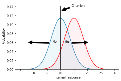
"Figure 2.0 : Internal response probability of occurrence curves for noise-alone (blue) and signal-plus-noise (red) trials. Since the curves overlap, the internal response for a noise-alone trial may exceed the internal response for a signal-plus-noise trial. Vertical line correspond to the criterion response. Any observation that falls to the right of the criterion is assigned the 'yes - tumor present' response. Any value to the left is assigned the 'no - tumor absent' response. Overlap in the distributions show cases where things can be confused."
An example criterion is indicated by the vertical line in Figure 2. The criterion line effectively divides the graph into four sections that correspond to: hits, misses, false alarms, and correct rejections. Let’s define these terms:
A hit refers to a signal which is classified as a tumor when it is in fact a tumor.
A miss refers to a signal which is classified as not a tumor (because it falls on the left side of the criterion) but is in fact a tumor. The doctors missed the diagnosis.
A false alarm is a case where no tumor was in the signal but the signal fell to the right of the criterion. This means the patient would be told they have a tumor when in fact they don’t.
A correct rejection is a case where there is no tumor and because the signal fell to the left of the criterion, the doctor made the correct decision to tell the patient they do not have a tumor.
To summarize, on both hits and false alarms, the internal response is greater than the criterion, because the doctor is responding “yes’’. Hits correspond to signal-plus-noise trials when the internal response is greater than criterion, as indicated in the figure. False alarms correspond to noise-alone trials when the internal response is greater than criterion.
To get a better sense of the corresponance between these terms and the graphs we have been considering, try out the following interactive plot (Figure 3) which highlight different regions (open in Jupyter Notebook if it doesn’t work for you on the website):
@widgets.interact(show_opt=widgets.Select(
    options=['hits', 'misses', 'false alarms', 'correct rejections'],
    value='hits',
    # rows=10,
    description='show me:',
    disabled=False
))
def plot_option(show_opt):
    x = np.linspace(-5,30,100)
    x2 = np.linspace(-5,30,100)
    y=stats.norm.pdf(x, 10,3.5)
    y2=stats.norm.pdf(x2,15,3.5)

    plt.plot(x,y)
    plt.plot(x2,y2,color='r')
    plt.ylim(0,0.15)
    plt.ylabel("Probability")
    plt.xlabel("Internal response")

    if show_opt == 'hits':
        ix = np.linspace(10,30)
        iy = stats.norm.pdf(ix,15,3.5)
        verts = [(10, 0), *zip(ix, iy), (30, 0)]
        poly = Polygon(verts, facecolor='pink',alpha=0.2,hatch='/',edgecolor='r')
        plt.gca().add_patch(poly)
        plt.annotate("hits", xy=(15,0.06),xytext=(15,0.06))
    elif show_opt == 'misses':
        ix = np.linspace(-5,10)
        iy = stats.norm.pdf(ix,15,3.5)
        verts = [(-5, 0), *zip(ix, iy), (10, 0)]
        poly = Polygon(verts, facecolor='pink',alpha=0.2,hatch='/',edgecolor='r')
        plt.gca().add_patch(poly)
        plt.annotate("misses", xy=(6,0.01),xytext=(6,0.01))
    elif show_opt == 'false alarms':
        ix = np.linspace(10,30)
        iy = stats.norm.pdf(ix,10,3.5)
        verts = [(10, 0), *zip(ix, iy), (30, 0)]
        poly = Polygon(verts, facecolor='lightblue',alpha=0.2,hatch='/',edgecolor='b')
        plt.gca().add_patch(poly)
        plt.annotate("false alarms", xy=(11,0.01),xytext=(11,0.01))
    elif show_opt == 'correct rejections':
        ix = np.linspace(-5,10)
        iy = stats.norm.pdf(ix,10,3.5)
        verts = [(-5, 0), *zip(ix, iy), (10, 0)]
        poly = Polygon(verts, facecolor='lightblue',alpha=0.2,hatch='/',edgecolor='b')
        plt.gca().add_patch(poly)
        plt.annotate("correct rejections", xy=(5,0.01),xytext=(5,0.01))

    plt.plot([10,10],[0,0.14],color='k')
    plt.annotate("Criterion", xy=(10,0.13),xytext=(14,0.14),arrowprops=dict(facecolor='black', shrink=0.1))
    plt.show()

display("Figure 3.0 : Interactive plot showing the different parts of the distributions corresponding to the hits, misses, false alarms, and correct rejections.")
'Figure 3.0 : Interactive plot showing the different parts of the distributions corresponding to the hits, misses, false alarms, and correct rejections.'
Suppose that the doctor chooses a low criterion (Figure 4, top), so that they respond “yes’’ to almost everything. Then they will never miss a tumor when it is present and they will therefore have a very high hit rate. On the other hand, saying “yes’’ to almost everything will greatly increase the number of false alarms (potentially leading to unnecessary surgeries). Thus, there is a clear cost to increasing the number of hits, and that cost is paid in terms of false alarms. If the doctor chooses a high criterion (Figure 4, bottom) then they respond “no’’ to almost everything. They will rarely make a false alarm, but they will also miss many real tumors.
fig, ax = plt.subplots(3,1,figsize=(8,17))

x = np.linspace(-5,30,100)
x2 = np.linspace(-5,30,100)
y=stats.norm.pdf(x, 10,3.5)
y2=stats.norm.pdf(x2,15,3.5)

# low threshold
ax[0].plot(x,y)
ax[0].plot(x2,y2,color='r')
ax[0].set_ylim(0,0.15)
ax[0].set_ylabel("Probability")
ax[0].set_xlabel("Internal response")
ax[0].fill_between(x2,y2, where=y>0.0,interpolate=True,facecolor='pink',alpha=0.2)
ax[0].fill_between(x,y, where=y>0.0,interpolate=True,facecolor='lightblue',alpha=0.2)
ax[0].plot([7,7],[0,0.14],color='k')

hits = 1.0-stats.norm.cdf(7, loc=15, scale=3.5)
fas = 1.0-stats.norm.cdf(7, loc=10, scale=3.5)
ax[0].annotate(f"Hits = {hits*100:.3}%", xy=(17,0.13),xytext=(17,0.13))
ax[0].annotate(f"False alarms = {fas*100:.4}%", xy=(17,0.12),xytext=(17,0.12))


# middle threshold
ax[1].plot(x,y)
ax[1].plot(x2,y2,color='r')
ax[1].set_ylim(0,0.15)
ax[1].set_ylabel("Probability")
ax[1].set_xlabel("Internal response")
ax[1].fill_between(x2,y2, where=y>0.0,interpolate=True,facecolor='pink',alpha=0.2)
ax[1].fill_between(x,y, where=y>0.0,interpolate=True,facecolor='lightblue',alpha=0.2)
ax[1].plot([11,11],[0,0.14],color='k')

hits = 1.0-stats.norm.cdf(11, loc=15, scale=3.5)
fas = 1.0-stats.norm.cdf(11, loc=10, scale=3.5)
ax[1].annotate(f"Hits = {hits*100:.3}%", xy=(17,0.13),xytext=(17,0.13))
ax[1].annotate(f"False alarms = {fas*100:.4}%", xy=(17,0.12),xytext=(17,0.12))


# high threshold
ax[2].plot(x,y)
ax[2].plot(x2,y2,color='r')
ax[2].set_ylim(0,0.15)
ax[2].set_ylabel("Probability")
ax[2].set_xlabel("Internal response")
ax[2].fill_between(x2,y2, where=y>0.0,interpolate=True,facecolor='pink',alpha=0.2)
ax[2].fill_between(x,y, where=y>0.0,interpolate=True,facecolor='lightblue',alpha=0.2)
ax[2].plot([15,15],[0,0.14],color='k')

hits = 1.0-stats.norm.cdf(15, loc=15, scale=3.5)
fas = 1.0-stats.norm.cdf(15, loc=10, scale=3.5)
ax[2].annotate(f"Hits = {hits*100:.3}%", xy=(17,0.13),xytext=(17,0.13))
ax[2].annotate(f"False alarms = {fas*100:.4}%", xy=(17,0.12),xytext=(17,0.12))

plt.show()
display(Caption(4.0, "Effect of shifting the criterion on the proportion of hits and false alarms."))

Notice that there is no way that the doctor can set their criterion to achieve only hits and no false alarms. The message that you should be taking home from this is that it is inevitable that some mistakes will be made. Because of the noise it is simply a true, undeniable, fact that the internal responses on noise-alone trials may exceed the internal responses on signal-plus-noise trials, in some instances. Thus a doctor cannot always be right. They can adjust the kind of errors that they make by manipulating their criterion, the one part of this diagram that is under their control.
12.12. The Receiver Operating Characteristic
We can describe the full range of the doctor’s options in a single curve, called an ROC curve, which stands for receiver-operating characteristic. The ROC curve captures, in a single graph, the various alternatives that are available to the doctor as they move their criterion to higher and lower levels. ROC curves (Figure 5) are plotted with the false alarm rate on the horizontal axis and the hit rate on the vertical axis. The figure shows several different ROC curves, each corresponding to a different signal strengths. Just pay attention to one of them (the curve labeled d’=1) for the time being. We already know that if the criterion is very high, then both the false alarm rate and the hit rate will be very low, putting you somewhere near the lower left corner of the ROC graph. If the criterion is very low, then both the hit rate and the false alarm rate will be very high, putting you somewhere near the upper right corner of the graph. For an intermediate choice of criterion, the hit rate and false alarm rate will take on intermediate values. The ROC curve characterizes the choices available to the doctor. They may set the criterion anywhere, but any choice that they make will land them with a hit and false alarm rate somewhere on the ROC curve. Notice also that for any reasonable choice of criterion, the hit rate is always larger than the false alarm rate, so the ROC curve is bowed upward.
fig = plt.figure(constrained_layout=True, figsize=(8,12))

x = np.linspace(-5,30,100)
x2 = np.linspace(-5,30,100)
y=stats.norm.pdf(x, 10,3.5)
y2=stats.norm.pdf(x2,13,3.5)
y3=stats.norm.pdf(x,20,3.5)


gs = GridSpec(3, 2, figure=fig)
ax1 = fig.add_subplot(gs[0, 0])
ax2 = fig.add_subplot(gs[0, 1])
ax3 = fig.add_subplot(gs[1:3, :])

ax1.plot(x,y)
ax1.plot(x2,y2,color='r')
ax1.set_ylim(0,0.15)
ax1.set_ylabel("Probability")
ax1.set_xlabel("Internal response")
ax1.fill_between(x2,y2, where=y>0.0,interpolate=True,facecolor='pink',alpha=0.2)
ax1.fill_between(x,y, where=y>0.0,interpolate=True,facecolor='lightblue',alpha=0.2)
ax1.set_title("d' ~= 1, lots of overlap")


ax2.plot(x,y)
ax2.plot(x,y3,color='r')
ax2.set_ylim(0,0.15)
ax2.set_ylabel("Probability")
ax2.set_xlabel("Internal response")
ax2.fill_between(x,y3, where=y>0.0,interpolate=True,facecolor='pink',alpha=0.2)
ax2.fill_between(x,y, where=y>0.0,interpolate=True,facecolor='lightblue',alpha=0.2)
ax2.set_title("d' ~= 3, not much overlap")


(11-10)/1.0

d0_p = np.array([[10,1.0], [10,1.0]])
d1_p = np.array([[11,1.0], [10,1.0]])
d2_p = np.array([[12,1.0], [10,1.0]])
d3_p = np.array([[13,1.0], [10,1.0]])
d4_p = np.array([[14,1.0], [10,1.0]])

for idx, params in enumerate([d0_p, d1_p, d2_p, d3_p, d4_p]):
    fas_a = []
    hits_a = []
    for criterion in np.linspace(-15,15,100):
        hits = 1.0-stats.norm.cdf(criterion, loc=params[0,0], scale=params[0,1])
        fas = 1.0-stats.norm.cdf(criterion, loc=params[1,0], scale=params[1,1])
        hits_a.append(hits)
        fas_a.append(fas)
    ax3.plot(fas_a, hits_a, label=f"d'={idx}")

ax3.set_ylabel("Hits")
ax3.set_xlabel("False Alarms")
ax3.set_title("ROC curve")

plt.legend(loc='lower right',title="Distributional sepatation")

plt.show()

display(Caption(5.0, 'Internal response probability of occurrence curves and ROC curves for different signal strengths. When the signal is stronger there is less overlap in the probability of occurrence curves, and the ROC curve becomes more bowed.'))

12.13. The role of information
Acquiring more information makes the decision easier. Running another test (e.g., MRI) can be used to acquire more information about the presence or absence of a tumor. Unfortunately, the radiologist does not have much control over how much information is available.
In a controlled perception experiment the experimenter has complete control over how much information is provided. Having this control allows for quite a different sort of outcome. If the experimenter chooses to present a stronger stimulus, then the subject’s internal response strength will, on the average, be stronger. Pictorially, this will have the effect of shifting the probability of occurrence curve for signal-plus-noise trials to the right, a bit further away from the noise-alone probability of occurrence curve.
Figure 5 shows two sets of probability of occurrence curves. When the signal is stronger there is more separation between the two probability of occurrence curves. When this happens the subject’s choices are not so difficult as before. They can pick a criterion to get nearly a perfect hit rate with almost no false alarms. ROC curves for stronger signals bow out further than ROC curves for weaker signals. Ultimately, if the signal is really strong (lots of information), then the ROC curve goes all the way up to the upper left corner (all hits and no false alarms).
12.14. Varying the noise
There is another aspect of the probability of occurrence curves that also determines detectability: the amount of noise. Less noise reduces the spread of the curves. For example, consider the two probability of occurrence curves in Figure 6. The separation between the peaks is the same but the second set of curves are much skinnier. Clearly, the signal is much more discriminable when there is less spread (less noise) in the probability of occurrence curves. So the subject would have an easier time setting their criterion in order to be right nearly all the time.
fig = plt.figure(constrained_layout=True, figsize=(8,4))

x = np.linspace(-5,30,100)
x2 = np.linspace(-5,30,100)
y=stats.norm.pdf(x, 10,3.5)
y2=stats.norm.pdf(x,20,3.5)
y3=stats.norm.pdf(x, 10,5.)
y4=stats.norm.pdf(x, 20,5.)
# y2=stats.norm.pdf(x2,13,3.5)
# y3=stats.norm.pdf(x,20,3.5)


gs = GridSpec(1, 2, figure=fig)
ax1 = fig.add_subplot(gs[0, 0])
ax2 = fig.add_subplot(gs[0, 1])

ax1.plot(x,y)
ax1.plot(x2,y2,color='r')
ax1.set_ylim(0,0.15)
ax1.set_ylabel("Probability")
ax1.set_xlabel("Internal response")
ax1.fill_between(x2,y2, where=y>0.0,interpolate=True,facecolor='pink',alpha=0.2)
ax1.fill_between(x,y, where=y>0.0,interpolate=True,facecolor='lightblue',alpha=0.2)
ax1.set_title("Low noise, not much overlap")


ax2.plot(x,y3)
ax2.plot(x,y4,color='r')
ax2.set_ylim(0,0.15)
ax2.set_ylabel("Probability")
ax2.set_xlabel("Internal response")
ax2.fill_between(x,y3, where=y>0.0,interpolate=True,facecolor='lightblue',alpha=0.2)
ax2.fill_between(x,y4, where=y>0.0,interpolate=True,facecolor='pink',alpha=0.2)
ax2.set_title("High noise, lots of overlap")

plt.show()

display("Figure 6.0 : Internal response probability of occurrence curves for two different noise levels. When the noise is greater, the curves are wider (more spread) and there is more overlap.")
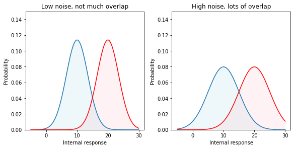
'Figure 6 : Internal response probability of occurrence curves for two different noise levels. When the noise is greater, the curves are wider (more spread) and there is more overlap.'
In reality, we have no control over the amount of internal noise. But it is important to realize that decreasing the noise has the same effect as increasing the signal strength. Both reduce the overlap between the probability of occurrence curves.
12.14.1. Discriminability index (\(d'\)):
Thus, the discriminability of a signal depends both on the separation and the spread of the noise-alone and signal-plus-noise curves. Discriminability is made easier either by increasing the separation (stronger signal) or by decreasing the spread (less noise). In either case, there is less overlap between the probability of occurrence curves. To write down a complete description of how discriminable the signal is from no-signal, we want a formula that captures both the separation and the spread. The most widely used measure is called d-prime (\(d'\)), and its formula is simply:
This number, \(d'\), is an estimate of the strength of the signal. Its primary virtue, and the reason that it is so widely used, is that its value does not depend upon the criterion the subject is adopting, but instead it is a true measure of the internal response.
12.14.2. Estimating \(d'\):
To recap… Increasing the stimulus strength separates the two (noise-alone versus signal-plus-noise) probability of occurrence curves. This has the effect of increasing the hit and correct rejection rates. Shifting to a high criterion leads to fewer false alarms, fewer hits, and fewer surgical procedures. Shifting to a low criterion leads to more hits (lots of worthwhile surgeries), but many false alarms (unnecessary surgeries) as well. The discriminability index, \(d'\), is a measure of the strength of the internal response that is independent of the criterion.
But how do we measure \(d'\)? The trick is that we have to measure both the hit rate and the false alarm rate, then we can read-off \(d'\) from an ROC curve. Figure 5 shows a family of ROC curves. Each of these curves corresponds to a different d-prime value; \(d'=0\), \(d'=1\), etc. As the signal strength increases, the internal response increases, the ROC curve bows out more, and d’ increases.
So let’s say that we do a detection experiment; we ask our doctor to detect tumors in 1000 CT scans. Some of these patients truly had tumors and some of them didn’t. We only use patients who have already had surgery (biopsies) so we know which of them truly had tumors. We count up the number of hits and false alarms. And that drops us somewhere on this plot, on one of the ROC curves. Then we simply read off the \(d'\) value corresponding to that ROC curve. Notice that we need to know both the hit rate and the false alarm rate to get the discriminability index, \(d'\).
12.14.3. Medical Malpractice Example
A study of doctors’ performance was performed in Boston. 10,000 cases were analyzed by a special commission. The commission decided which were handled negligently and which well. They found that 100 were handled very badly and there is good cause for a malpractice suit. Of these 100, only 20 cases were pursued. What should we conclude?
Ralph Nader and others concluded that doctors are not being sued enough. But this conclusion was based on only partial information (hits and misses). I did not tell you what happened in the other 9900 cases. How many law suits were there in those cases? What if there were many (e.g., 9000 out of 9900) false alarms? The AMA concluded that doctors are being sued too much.
12.15. References
- MDN70
Storms. M.D. and R.E. Nisbett. Insomnia and the attribution process. Journal of Personality and Social Psychology, 2:319–328, 1970.
- Mai31
N.R. Maier. Reasoning in humans: ii. the solution of a problem and its appearance in consciousness. Journal of Compartive Psychology, 12:181–194, 1931.
- NW77
R.E. Nisbett and T.D. Wilson. Telling more than we can know: verbal reports on mental processes. Psychological Review, 84(3):231–259, 1977.
- 1
As an aside, when I read these classic reports, I do wonder if perhaps subjects just happened to be more relaxed in the aroused condition for exactly the reasons they report and it is just sampling error (the subjects in one condition randomly had life events that were less stressful during the study period) and so people do have very good introspection on what controlled their sleep in the different conditions, but I will for now accept the authors’ description of this.